Disclaimer: The comments in this blog are my personal opinion and may or may not reflect an adopted position of the city of Glendale and its city council.
A logo is “a graphic representation or symbol of a company name, trademark, abbreviation, etc., often uniquely designed for ready recognition.” (dictionary definition). This is the logo that has been chosen… by whom we’ll discuss further.

New city logo
Last fall the city entered into a contract with Catapult Strategic Design. The company offers “brand development and visual identity services.”(from their website). Catalpult was tasked with the development of a manual to outline the parameters of logo use and how the new logo was to be used by all employees. The development of the manual was for a fee of an estimated $35,000, although I have heard other figures. The logo creation was “gratis” (at no charge to the city). That is my understanding of the contract. If I am incorrect in what I know I will be more than willing to correct my understanding.
City logo
The city’s senior management decided that it was time to update the city’s logo and council approved. Here is the current logo. It’s been the logo for at least 50 years. There is nothing wrong with the desire to update the city’s logo. The city is moving forward at a rapid pace. An updated mission statement and values had been created and approved by the city council. The city is moving into the 21st Century and with it is embracing more and more technology and innovation. A new logo would demonstrate all of that and more.
After Catapult had been chosen, their principals met one on one with each councilmember, as well as others including stakeholders, to try to identify the most important elements of Glendale that might be captured in a new logo.
I shared in my meeting with them that I thought it was a very difficult task because I felt there was not one thing memorable for which Glendale really stood out. The City of Phoenix’s logo of the Phoenix bird rising from the ashes is perhaps the most iconic logo in the entire state. I didn’t envy their task and wished them good luck.
The first set of 5 possible logos (I didn’t save those images and no longer have them) was selectively distributed (council was included) in a survey format for feedback. Although council was not told the results of that survey, apparently all were rejected and the company was instructed to try again. A second set of logos was produced and the same survey was disseminated. (Again, I didn’t save the images and no longer have them). Just as with the first set, I answered the survey in the negative indicating that I disliked them all.
Subsequent to the surveys of proposed logos for consideration or acceptance, each of the councilmembers met with senior management to discuss the preferred logo. I strongly and adamantly indicated that I disliked all of the logos offered and in fact, would not use any of them. It is my understanding the selected logo was vetted by a panel comprised of employees staffing senior management.
No public discussion, no council workshop occurred before the final adoption of the new logo. This is the reason Councilmember Tolmachoff introduced as a Council Item of Special Interest (CIOSI) at the Tuesday, February 26th council workshop meeting a discussion of the process used. She contends, and I agree, that there was no transparency in the process used to select the logo. There is also the issue of cost to rebrand everything in Glendale from vehicles to city stationary. Council should know the cost and frankly, we do not. If the cost of rebranding everything in the city is over $50,000 it requires council approval. I look forward to the workshop discussion that will occur sometime in the near future.
Personally I do not like the chosen logo but keep in mind that art, even logo art, is subjective. As many people may like the new logo as dislike it. I have no problem with the adoption of a new city logo, just not this one… in this manner. The selected logo is not, in my mind, distinctive or unique, or even representative of anything associated with Glendale. It does not convey the feeling of uniqueness, moving forward or the vibrancy of Glendale.

Greenbay Packers logo
Others, on my Facebook page, have commented that the new logo is similar

Google logo

Gatorade logo
to the logos of the Greenbay Packers, Gatorade or even Google itself. What is even more disturbing is that Google sells for 69 cents online a “G” very similar to the new Glendale logo. The colors are obviously different and the horizontal line on the G looks as if it is breaking up. See it here.

Google G for sale online
Those who have advocated for the adoption of this new logo contend that it isn’t so much about the actual image chosen but rather it signals a new age in Glendale. They believe that over time, the new logo, will embody and signify the new directions taken in Glendale.
That is not what a logo means to me. It is supposed to be iconic…think of the Nike swoosh or Apple’s image of the apple. They all convey something about the branding whether it’s a feeling or a definitive element of the product or entity. It’s something that should be immediately identified as belonging to the entity or product it is branding.
I am ready for a new logo for Glendale. I am not ready for the new logo that has been selected or for the lack of healthy debate about its appropriateness for Glendale.

© Joyce Clark, 2019
FAIR USE NOTICE
This site contains copyrighted material the use of which is in accordance with Title 17 U.S. C., Section 107. The ‘fair use’ of any such copyrighted material as provided for in Section 107 of the US Copyright Law and who have expressed a prior interest in receiving the included information for research and educational purposes. For more information material on this site is distributed without profit to those who have not always been specifically authorized by the copyright owner. We are making such material available in our efforts to advance understanding of environmental, political, human rights, economic, democratic, scientific and social justice issues, etc. We believe this constitutes a ‘fair use’ of any such material. For more information go to http://www.law.cornell.edu/uscode/17/107.shtml. If you wish to use copyrighted material from this site for purposes of your own that go beyond ‘fair use,’ you must obtain permission from the copyright owner.
 This Monday, Feb.25th, the city held a naming ceremony dedicating a portion of Bethany Home Road to Cardinals way. I was honored to be able to speak at this event. The following are the remarks I delivered.
 started by the Missionary Church Association. Bethany Home was established in 1908 by the church and dedicated to God. It was a Christian home for the sick. But how did the Missionary Church come up with that name? They did some of their missionary work in what is now Israel in Bethany , an ancient town near Jerusalem.

 again in 2020 for the Yucca district city council seat. Then I enjoyed our holidays. Just like everyone else, I spent the time shopping, mostly on Amazon; baking annual Christmas treats; wrapping presents, decorating the tree and preparing a scrumptious Christmas dinner. All the things with which we become preoccupied during the season occurred. The new year of 2019 has begun replete with traditional resolutions sure to be broken within the month. I wish all of you a Happy New Year.
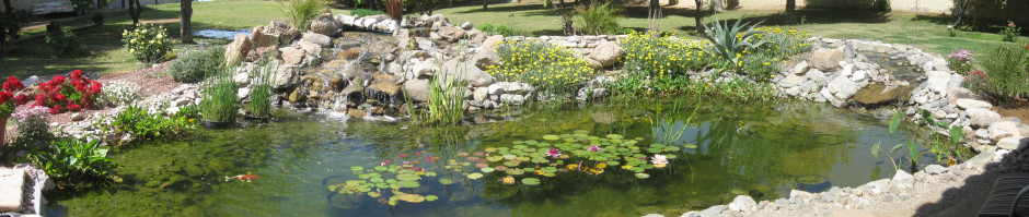
 purpose is to eat mosquito larvae. We introduced about a dozen of them into the pond years ago and seem to host a constant population of about a hundred of them at any given time. Ming was the first fish we put into the pond about 5 years ago. This was after refilling the pond when I had added so many chemicals to rid the pond of algae and killed off the few fish that I had. I let the new pond water settle and age, if you will. Then I placed a 3” to 5” Ming into the pond as a sacrificial test to see if the pond water was healthy enough. Ming survived and thrived and is the oldest of all of the Koi. I estimate that Ming is probably about 3 feet long and weighs in at 10 to 15 pounds.
 copper coloring…after all, Arizona is known for its copper mining. Mud Puddle is one of the last fish we acquired and is a hog. He eats all the time. He can be seen grazing on the algae on the rocks all day long. His prolific eating has caused him to grow and outpace many of his brothers and sisters purchased at the same time. Mud Puddle is slightly smaller than Ming. Probably about 2 feet long and coming in around 10 pounds.
 nosiest of the Koi. When I go to the edge of the pond to trim vegetation he will cruise on over to see who’s there and what is happening. Convict is about 2 ½ feet long and between 10 and 15 pounds.
 affect Koi fish.
 In this case, the citizen (a Vietnam vet) who has an injunction to prevent further harassment by his neighbor is being cited for an inoperable vehicle that has been repurposed as “yard art” and for having a flag pole greater than 6 feet tall.
 home was purchased in 1998. I assume that it is grandfathered in but I certainly had no idea about code restrictions on resident flag poles. Here is ours. By the way, the resident has taken down the flag pole.
 only rule upon which code could hang its hat was that the vehicle is ‘inoperable’. By the way, I have antique tractor equipment as “yard
 art”. It’s definitely inoperable and again, probably grandfathered in since it has been there since the house was built. Here is our ‘yard art’.